
Charities Project: Continued
Posted: March 20, 2015 Filed under: Subject yr2 | Tags: advertisements, art, artwork, cartoons, charities, charity, color, colour palette, colours, donkey, helentowrieillustration, illustration, leaflets, patterns, the donkey sanctuary Leave a commentFor the past few weeks I have been working on a project where I have to create some form of illustrative advertisement for a charity of my choosing.
I decided to go with The Donkey Sanctuary, Based in Sidmouth. I would have preferred to choose somewhere closer so that I could visit the donkeys and see what the charity does for myself, but sadly I couldn’t find any near by. Nonetheless, found The Donkey Sanctuary‘s website and was thoroughly impressed with their dedication to the welfare of donkeys, and in addition how they used them as therapy for adults and children with disabilities or mental disorders.
These are some of my designs so far for little cards/leaflets that could be given to people either though their mail boxes or given to them in the street in order to advertise this charity:

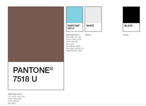
After getting the colour scheme, I changed the colour of the wall the donkey is resting over so that it was closer to the duck egg colour that was sent to me. I have also done a few more designs also using this repeating donkey pattern that cab be seen in the first image.

The second two images are a little card that has a slide along part in the middle, where you can see the donkey go from sad to happy:


I like the interactive quality of this design, but think that the image size of the donkey is a little small and hard to see. I also don’t want my advertising campaign to be too “guilt trippy” – which I don’t think this is, but it could be treading on the line.
However, this is only mt first draught, and I feel like there is a lot of room to develop and improve this.
The Last design is a concertina of a barn with donkeys inside holding small snippets of information about the sanctuary:

This one is probably my least favourite design – although I do like the the barn with donkeys inside idea. I have decided to completely revamp this design making it more colourful and professional looking:

This is a digital copy of the new concertina layout. I have brightened it up with the duck egg colour from the official colour scheme, and used my friendly looking cartoon donkeys to decorate it. I still need to redo the cover of this little booklet – probably with a cleaned up version of the pre-existing cover with the colours most likely inverted to avoid so much white space.
Since getting the colour scheme I have also touched up the pop-up donkey leaflet a little – changing the colours slightly and adding a little more information:


As mentioned before, all of these are still in the very early stages of planning and I am very grateful for the extension that everyone was given for this project. It has been extremely fun to explore the world of illustrative advertisement and I hope to practice more of this in the future.
The City
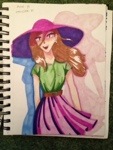
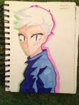
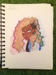
Posted: March 15, 2014 Filed under: Subject | Tags: art, cartoons, character designs, characters, city project, comics, illustration, the city Leave a commentHere are some further character designs. I am not yet sure how large a roll individual characters will play in my comic, and whether they will even speak, but I wanted to have characters ready for a scenario I might include involving a group of young people.


Recent Comments